
Craft
Never Approve a Cabinet Color in a Showroom
A showroom is the worst place to approve a cabinet color. Light decides what a finish looks like — and the room it is going into is where the decision belongs.
Every showroom in this industry is built to make you feel certain. The lighting is even, the samples are held at arm’s length against a neutral wall, and nothing in the room competes with the thing you are looking at. That is the point of a showroom, and we build ours accordingly.
It is also the worst place in the world to approve a cabinet color.
Not to choose one — choosing is exactly what a showroom is for. The door construction, the edge detail, the weight of a drawer on its runner, the shortlist of four finishes you can live with. But the approval, the yes-build-it-in-this, belongs somewhere else: in the room the kitchen is going into, at the hours you will actually stand in it.
A color is a property of the light, not the finish
Color science does not treat a surface as having a color at all. It treats a surface as having a spectral reflectance, which only becomes a color when a specific light hits it. The International Commission on Illumination formalizes this in its standard illuminants: illuminant A represents tungsten-filament light at roughly 2,856 K, D50 represents daylight at about 5,000 K, and D65 represents average daylight at about 6,500 K. Same door, three different measured colors.
The CIE is also candid that D65 is a convenient fiction. Daylight’s spectral power distribution shifts with season, time of day and geographic location — which is a technical way of saying that a kitchen in Boston in February is not lit by the same light as a kitchen in Burbank in July, and neither is lit by the light in the room where you signed off.
The colors most likely to betray you are the ones you want
When two samples match under one light and stop matching under another, the term is metameric failure. It is not a defect. It is what happens when two materials arrive at the same appearance by different spectral routes — a lacquered door and a stone counter, say, or a veneer and a painted panel.
RMIT’s open-access text on colour theory is specific about which colors are most prone to it: whites, greys, beiges, blacks, pinks and mauves. That is, more or less, a complete inventory of the modern luxury kitchen palette. The greige that reads warm under the showroom’s lamps and green in your north-facing kitchen is not a mistake anyone made. It is physics doing what it was always going to do.
The lamp overhead is editing the wood
Showroom lighting is chosen to flatter, and flattery is measurable. The US Department of Energy has spent years documenting what it calls the widely acknowledged limitations of the Color Rendering Index. In one study its researchers compared ratings of nearly 5,000 real and theoretical light sources and found that CRI systematically penalizes vibrancy in reds, with the consequence that few light sources on the market render vibrant reds well.
Reds are not an abstraction here. They are walnut, cherry, rift oak, terracotta, the warm undertone in almost every stone worth specifying. A lamp that handles reds badly will quietly flatten the exact material you are paying the most for — or, in the other direction, lend a cheap veneer a depth it will not have at home.
Then there is scale. A color spread across thirty feet of cabinetry reads more saturated and more present than the same color on a four-inch chip. The sample is not just under the wrong light. It is the wrong size.
Where a cabinet color should actually be approved
The fix costs nothing and takes a week.
Get a full door, not a chip, and get the counter, floor and metal samples with it — metameric failure shows up between materials, not within one. Stand them in the actual room, in the plane they will occupy: doors vertical, counters flat. Light strikes a horizontal surface and a vertical one at completely different angles, and the same finish will not behave the same way on both.
Then look three times. Mid-morning, when daylight is doing most of the work. Late afternoon on an overcast day, which is the hardest test any interior color faces. And at night, under the fixtures that will actually be installed — not the ones there now.
The last instruction is the one almost nobody follows: specify the lighting before the finish. Fix the color temperature and the rendering quality of the lamps first, then choose the cabinet color under them. Every designer does this in the opposite order, and every designer has watched a client discover, at handover, that the kitchen they approved is not the kitchen that was built. Nothing was substituted. The light simply changed.
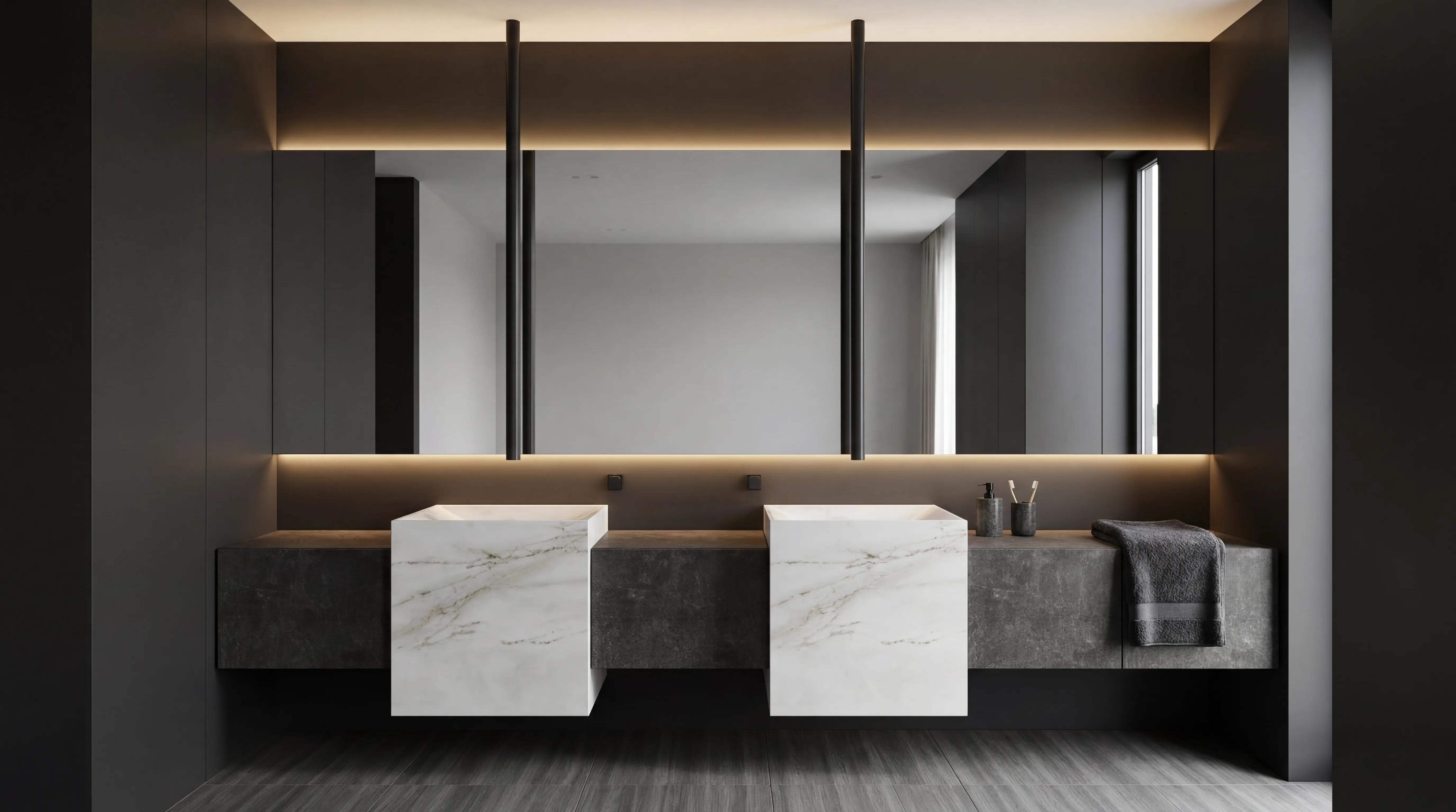
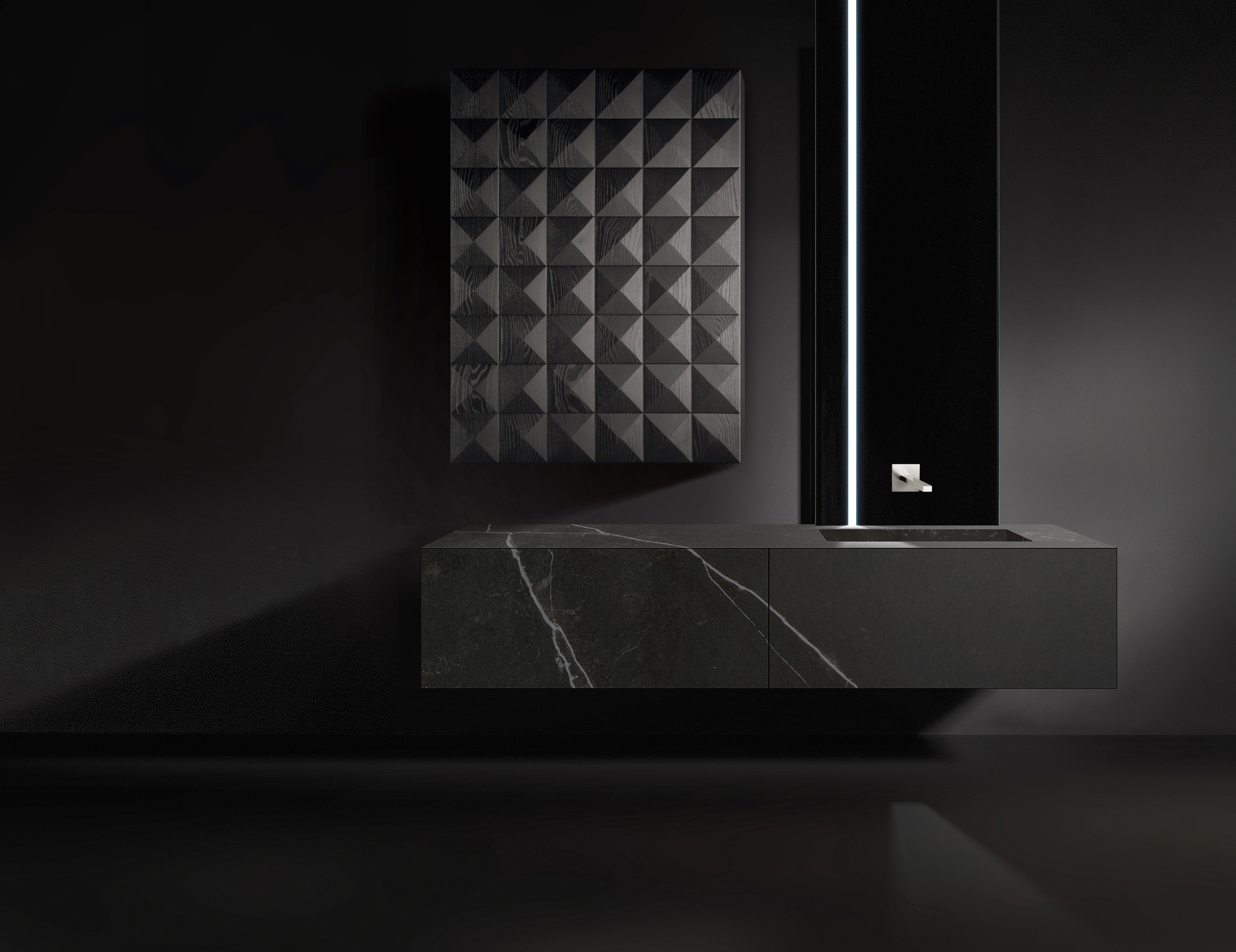
The same discipline applies anywhere a finish meets a surface it has to agree with — a run of kitchen cabinetry against stone, or a lacquered vanity against a marble top in a room with one small window.
A showroom sells certainty. A north-facing kitchen at four in the afternoon is where you find out whether it was true. Approve the color there.
Book a private showroom tour
If this changed how you are thinking about finishes, the next step is not another article. Come and decide what you are building — the construction, the detailing, the shortlist — and then take the doors home and let your own light have the last word. Book a private showroom tour and spend an hour with our design team, one on one, in Chicago’s Fulton Market, SoHo, the Dallas Design District, or any of our eight studios across the country.