
Craft
Color Drenching Is the Beige of 2026
Color drenching is 2026's most-Googled kitchen look — and it's already peaking. Why saturating a room in one hue erases the depth that actually lasts.
Color drenching is the most-Googled kitchen look of the year. Walls, trim, ceiling, cabinets — one saturated hue, wrapped corner to corner, until the room reads as a single confident gesture. Designers call it bold. Homeowners call it cohesive. We'd call it the beige of 2026.
Not because the colors are timid. They are the opposite. Because the idea underneath is the same one that gave us a decade of greige: pick one safe move, apply it everywhere, and hope that uniformity passes for taste.
A drenched room photographs beautifully. It also flattens the one space in your home built from more materials, at more heights, in more light than any other. A kitchen is not a mood board. Painting over its depth is not the same as designing it.
Color Drenching Is Already Peaking
Color trends are the fastest-moving decision in a house. As Homes & Gardens put it in late 2025, a shade can be all the rage one month and forgotten the next — and its designers are already naming forest green, mustard yellow, and saturated "laboratory" colors as going out of style for 2026, one of them calling the look "overused and overproduced."
The drench itself is following the same curve. Apartment Therapy reports that color-drenched rooms dominated social feeds for more than a year, and the trend has already mutated into "stripe drenching" — now, by their account, the more popular maximalist move. When a look starts spawning sequels, it is peaking, not arriving. Committing your cabinetry to it now is buying at the top of the market.
A Kitchen Runs on Contrast, Not Sameness
There is a functional reason drenching belongs in a powder room and not a working kitchen. You need to read a kitchen — where the counter meets the cabinet, where the hob interrupts the run, where a drawer breaks the line. Saturating every plane in one color erases those seams. In a living room that is atmosphere. At the counter it is a usability tax you pay three times a day.
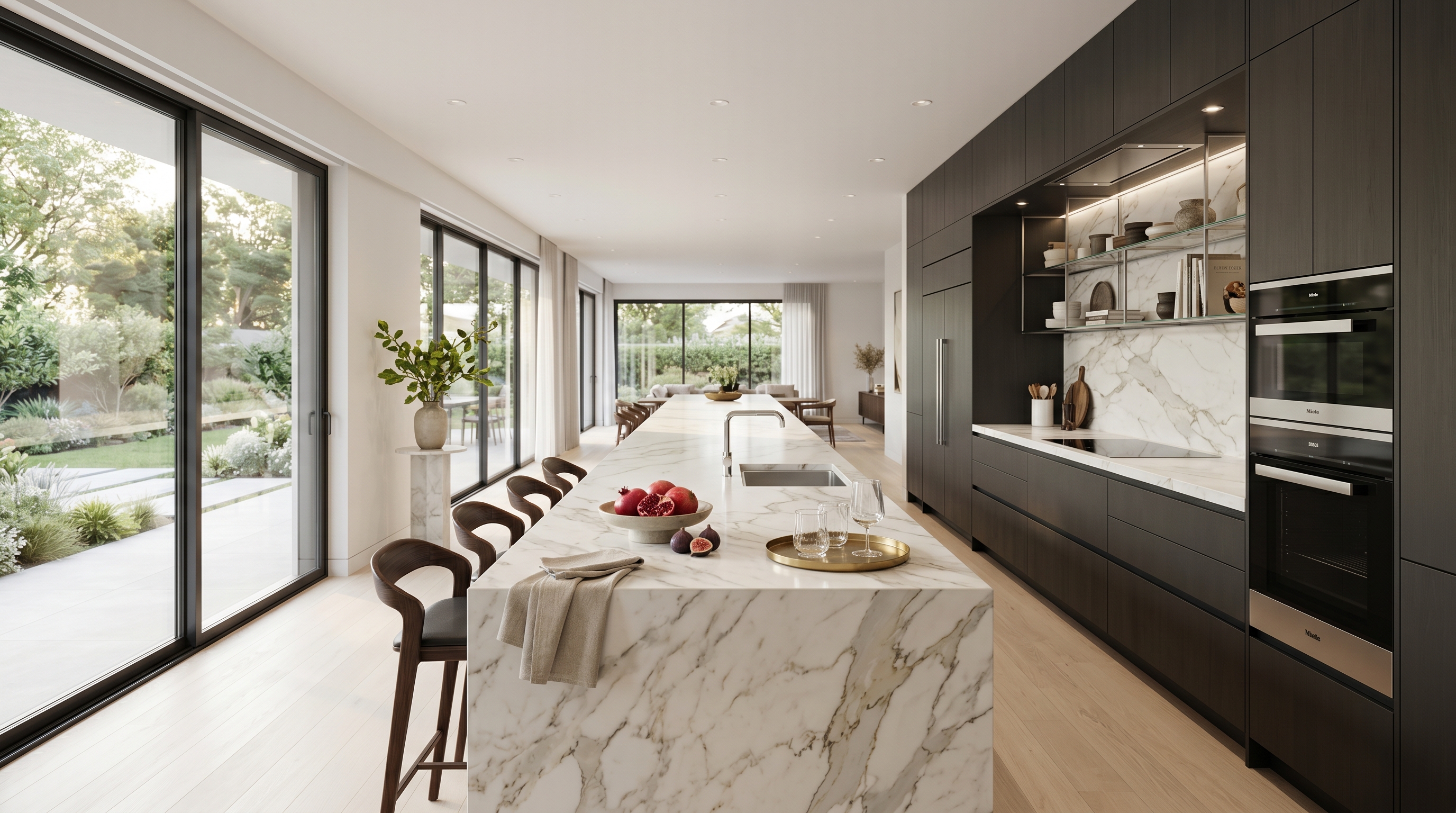
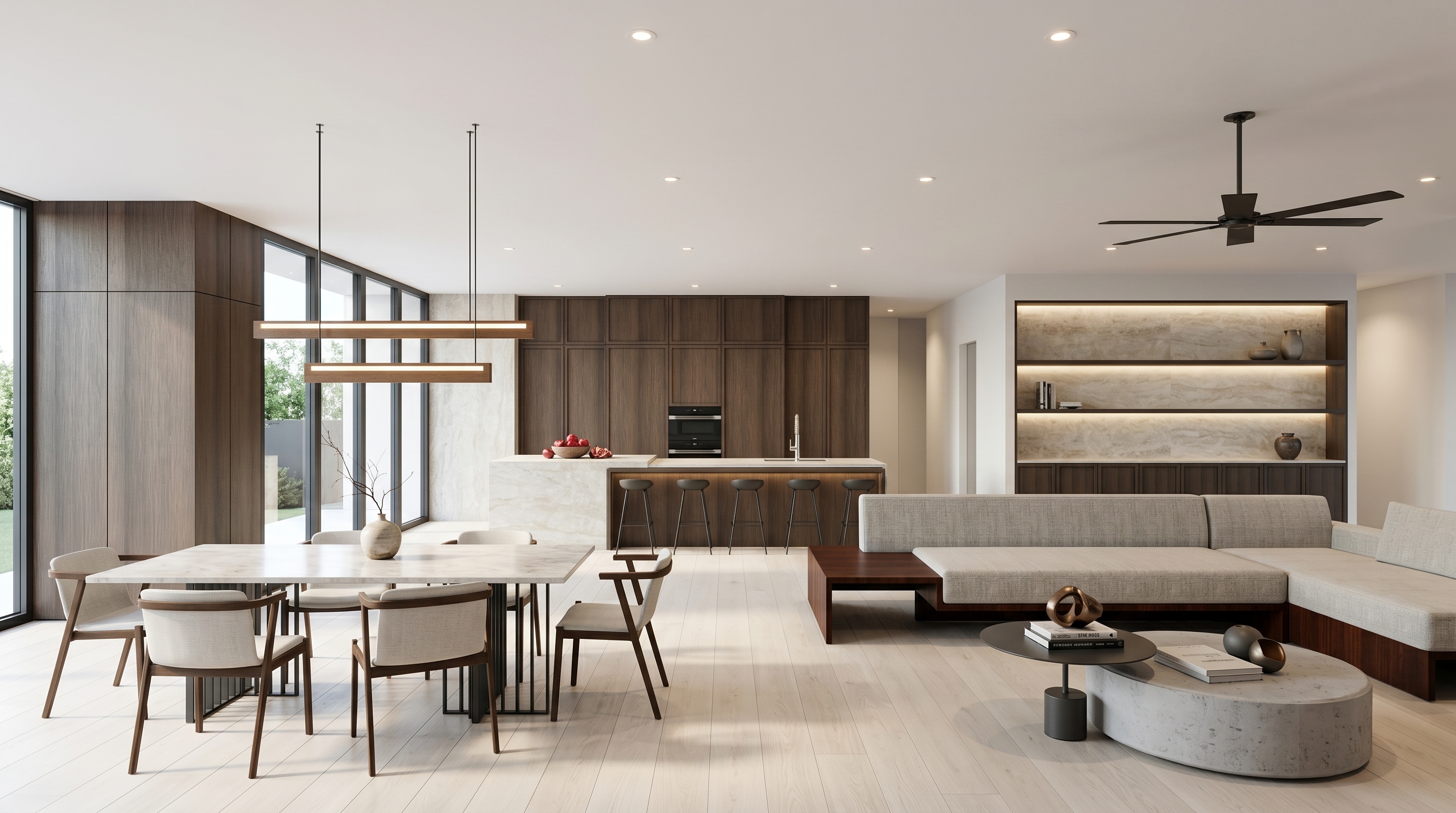
The deeper problem is where richness actually comes from. The designers now being quoted on 2026 palettes have moved toward muddied, earthy tones precisely because they "pair effortlessly with wood, stone, and linen." Read that again: the color is doing less so the material can do more. Depth in a kitchen is a function of texture and tone — oak against stone, matte against honed — not of how completely you can bury a room in a single pigment.
Paint Is the Least Durable Decision You'll Make
Here is the quiet risk in a color-drenched kitchen: it ties your most permanent surfaces to your most disposable variable. Repainting a wall is a weekend. Refinishing or replacing cabinet fronts is a renovation. Wrap the cabinetry, the millwork, and the ceiling in this year's hue, and you have welded a trend with a twelve-month shelf life onto the parts of the room meant to last decades.
That runs against everything durable kitchens are built on. The German kitchens we make are engineered to tolerances measured in tenths of a millimeter and carry a 25-year structural warranty. You do not put that kind of permanence behind a color that photographs as current today and dated by the next cycle. The value lives in the material and the construction — so let those be the things you commit to.
Let One Material Carry the Room, Not One Color
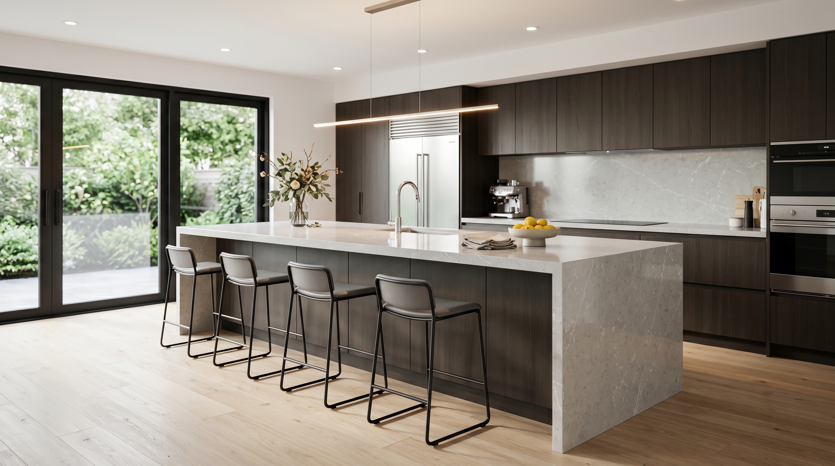
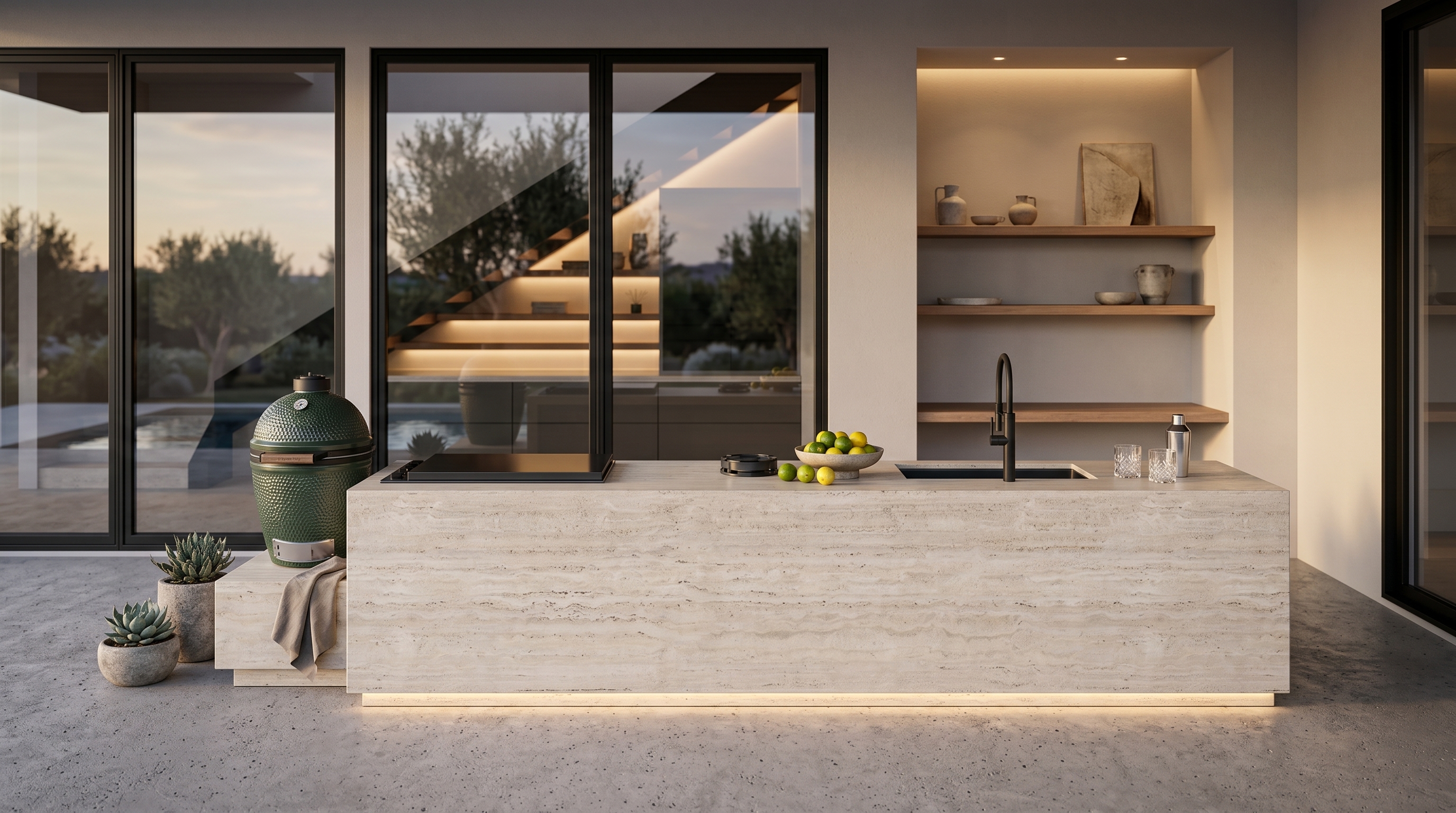
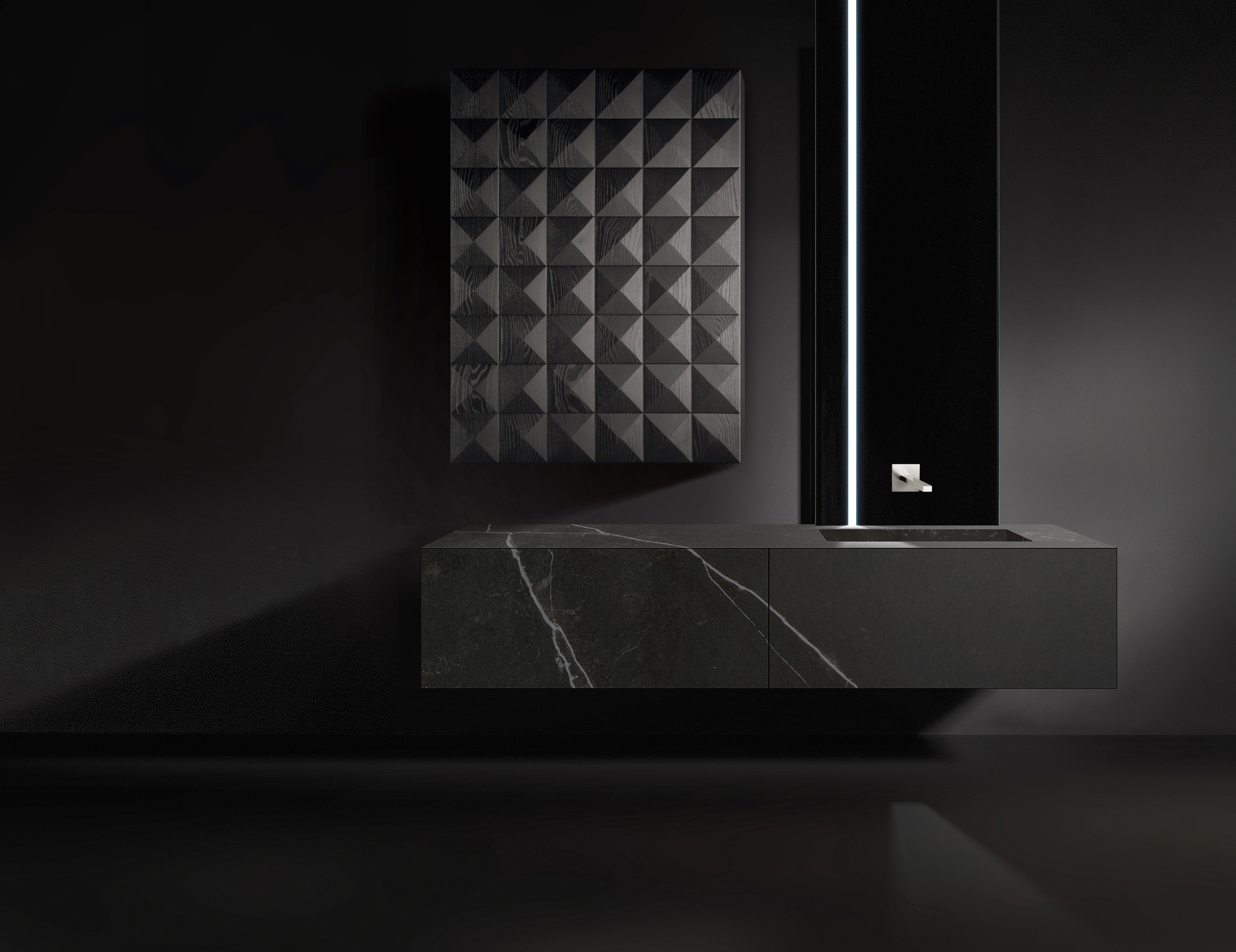
The practical move is a reversal. Instead of choosing a color and drowning the room in it, choose a single enduring material and let it set the palette. German oak, honed stone, matte lacquer, brushed metal — pick the one that will anchor the space and build outward from its natural tone.
If you want the enveloping quality that drenching promises, get it honestly: a low-saturation, slightly "muddied" tone — the muted olive or warm clay designers are treating as the new neutrals — on the walls only, with cabinetry left in material rather than paint. Contrast through texture and tone, not a single coat. The room reads resolved, and none of that resolution depends on a color that expires.
Drench a room and you get a photograph. Design one and you get a kitchen that still looks deliberate after the algorithm moves on. Color is the fastest thing in the room to date — so build the parts that can't.
Book a Private Showroom Tour
If this changed how you're thinking about color in your kitchen, the next step isn't another article. Spend an hour with our design team, one on one, standing in front of the German oak, stone, and lacquer that actually carry a room. Book a private showroom tour at any of our studios — from SoHo to the Dallas Design District — and see what depth looks like before you commit a single color to it.